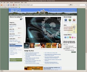
Yesterday, the City of Raleigh unveiled it’s new website: the first update in a dozen or more years. The old website has long been a pet peeve, with it’s cryptic, miles-long URLs and lack of photographs or graphics. To find anything useful, users often had to resort to using the search box.
Unfortunately, that’s also the problem with the new website: to find anything useful the user has to use the search box. In fact, it’s more of an issue now. The old site at least attempted to categorize information in a hierarchical format (for every page, you saw a list of breadcrumbs that showed you where you were in the site). The new one, however, makes no attempt at all at organizing data (at least as far as I can tell).
To give an example, I’m trying to update my web links for the old site pages to point to the new pages. One went to a page to request a city inspection of a residential property. On the new site I can no longer find the home page for the city inspections department.
And that’s the problem with search-based websites: when a user must go through a search, the user bypasses any organization that’s been added to the site. There is no “home page” because every search result becomes a de-facto home page. When the user is not provided the context of their search result (“this page is part of the city inspections department under the forms category, etc.”) then every subsequent web visit must begin with the search engine. Those kinds of websites don’t scale very well.
With any luck, the new site has the flexibility to build a proper hierarchy in addition to using the search box to provide information. And maybe I will learn how to find my way around the new site. Time will tell, I suppose.

As I’m trying to fix broken links created by the move, I’m discovering that I really hate this new site. And I hate that they spent $500k on it. I know what a $500k web site looks like. This isn’t it.
I agree. I think the city got taken for a ride.