I love editing so much that I married an editor. I like to think that I had some natural talent at editing before I met Kelly but I definitely gained a whole new appreciation for the art of editing after watching what Kelly does. I knew that an editor was responsible for making sure all the i’s were dotted and the t’s crossed, but what I didn’t know before I met Kelly was how much an editor’s role is as much arbitrator than anything else. In the publishing world, anyway.
Blogging is a bit different when it comes to editing. That is, I don’t really do any editing. I love swiftly cranking out a post, following an idea as my fingers fly unfettered across the keyboard, not caring much about the mistakes that might pop up. The reason I can do this is that blogging is extraordinarily affordable. I invest my time in composing my posts but not much else. Should a correction need to be made, I can always do a quick search-and-replace to fix it. I can also post a new post as a correction. Some times I even rewrite my posts after they’re posted when I think I can improve on what I have to say. I guess you could say that I take full advantage of the no-rules frontier that is blogging. Blogging doesn’t have to be perfect because it’s fluid and cheap!
On the other side are the people who are paying real money to get their word out, through mailings and other printed materials. I’m often appalled at the complete lack of editing done on some of these, especially when so much money has been put into printing these materials.
This was long my argument against the self-publisher Lulu’s business model, where the company doesn’t get paid until a user sells a book. There are many promising books being submitted that aren’t going anywhere without being worked over with a red pen. I understand Lulu now offers editing services through third parties, though I don’t know how popular these services are.
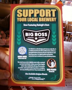
A flyer advertising real estate was riddled with mixed case, with apostrophes and exclamation points in strange places. The photo above is from a placard in Applebee’s advertising Big Boss Brewing’s ales. It has a few “it’s” where it should have “its” (and, yes, I’m a reformed “it’s-er.”) Not only that, There is an unfinished sentence at the bottom! “Very reminiscent of” … what?
This placard is printed on heavy, quality paper in full color. It must have cost a bundle to print these and yet ten minutes of editing could have kept Applebee’s from looking like morons (okay okay … maybe editing isn’t that powerful).
I don’t understand why people spend good money to print things up but don’t spend a little time reading what they’re writing. It just tarnishes whatever reputation the material was trying to build.

dude, so true.
My favorite from the past year is when the NC State baseball had a big blunder on their media guide: Wolpfack!!
awesome
Wow, that’s outrageous! I need a picture!
Here’s an URL:
http://img299.imageshack.us/img299/70/wolpfack.jpg
My attempt at embedding:
nope, won’t let me post images. At least the URL got through